How To Design Analytics Dashboards From Google Webmaster Tools Data
- Fahad H

- Nov 20, 2013
- 6 min read
SEO Chaos! That was my topic last month. Ever since Google blacked out keyword-level data, people have been scrambling to substitute or replace it. Not surprisingly, I received a lot of emails about that article, asking how to use Google Webmaster Tools (WMT) data as a replacement source.
The general answer is that you can’t use WMT data as a true replacement data source. That’s because Google Webmaster Tools does not collect any information about user engagement on your site. Instead, it collects user behavior on the search results page.
However, you can use your WMT data as a proxy. (Hey, some data is better than zero keyword data!) Below, I’ll share some tips — and a lot of visuals — for how you can do just that.
Getting Started: 6 Key Elements To Build Your WMT Dashboard
In order to take full advantage of your WMT data for storytelling and insights, you’ll need to build a dashboard that surfaces meaningful findings. Of course, there is no one-size-fits-all solution; however, there are some important elements to keep in mind as you build yours. The below tips will help you maximize the value and insights from your effort.
1. Be Granular
Even though people love to talk about big data, the real insights are on the micro level. Considering that, make sure you export your data at the most granular level possible (e.g., daily sets, filtered by image, Web and mobile) and set the filters to the countries that matter.
2. Clean Your Data
Exporting data is only half the job; you also need to clean-up your data. Often, the limitations of the export format can cause some special characters to be imported incorrectly. They can often end-up looking something like this: _¡„„â_µ„Û_ü.
Make sure you remove any data points that are irrelevant before you start building your dashboards. In addition, you also need to eliminate any substitution entries. Such entries occur when there are not enough clicks. For example, a substitution entry may reflect a value of < 10.
3. Segment & Categorize
In order to surface interesting insights and findings, you will have to slice/segment your data. As you’ll see further down in the charts, it becomes really interesting when you start segmenting your data even deeper. The example below takes the “Convertible” terms’ CTR, and then divides them even further by branded vs. unbranded.
As you can see in the example, on first glance it looks like Convertible terms are doing average. But once you divide them, you can see that the branded Convertible terms have an amazing CTR while the unbranded ones are significantly lower.
4. Don’t Just Report The Data — Use It To Tell A Story
The most important thing to consider when reporting search-specific data is that it needs to answer business-relevant questions, and tell a story that makes sense to a marketer.
Instead of telling management — or your client — that they have less traffic, tell them what’s really going on. For example, you could say, “The data show that you have increased your visibility around Convertible-related terms; however, you experienced a big decline in truck-related content.”
5. Make It Interactive
When it comes to reporting, I find that nothing impresses clients more than the ability to analyze and evaluate the data in real-time. As you build your dashboard, strive to make it interactive, so its users can drill down into the data.
All of the dashboards that I use allow me to “doubleclick” into the data, to filter and adjust ranges and terms. This function allows me to respond to clients’ questions immediately, instead of telling them that I will need to get back to them.
6. Align It With The Business KPIs
Make sure that your WMT dashboard is aligned with your business or product lines, or those of your client. For example, if your organization looks at the business by model or service line, align your report around that. Consider making one view for each line of business instead of merging it all into a single view.
This Is What A WMT Dashboard Could Look Like
Enough talk, let’s get to the visuals! Below, I’ll show you an example of what a WMT dashboard could look like and how you could use it.
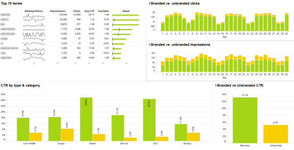
The high-level dashboard below consists of numerous screens, and highlights some meaningful metrics that I use to tell a brand’s story. Most of the metrics are pretty self-explanatory, but I hope they give you some inspiration or ideas. (Note that in order to support the visuals, I’ve added some rules to separate branded vs. unbranded and some product-related keywords.)

The graph above highlights the top 10 terms by impressions. It shows some of the default Google Webmaster Tools data such as impressions, clicks, average CTR, and average rank, as well as the overall reach and monthly ranking history.

The above chart highlights the difference in CTR depending on the keyword category and whether it is unbranded (yellow) or branded (green). It illustrates how your meta descriptions, microformats and titles are performing in terms of answering the consumer question.

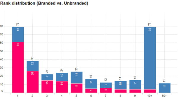
The above chart shows the rank distribution for the brand’s top terms. It colors them by branded (red) vs. unbranded (blue). (It gets really interesting if you color code further by theme.)

The above chart is a great tool to monitor the amount of content you have in the eyes of Google. In other words, it shows you the number of terms you are visible for. For additional clarity, this data was segmented by images (green) and content (blue), but it could be segmented by a number of other elements, such as theme, brand, or rank, etc.


The two charts above show you the CTR by position and key phrase theme; you can also break these down further by branded and unbranded terms. For example, the above table shows you the difference in CTR by position for branded and unbranded Convertible terms.

This set of charts shows the clicks (red) and CTR (green) by day of week. It provides a lot of insight about consumers’ behavior in regard to timing and intent. For example, this slice of the data helped us identify a key trend for one of our beauty brands.
It revealed an increase in research-related terms (such as makeup tips, etc.) during the Thursday-Friday time period, and more purchase intent terms between Friday and Sunday. We use insights like this to plan media in other channels such as display, radio and broadcast.
Taking It A Step Further
As you think about developing your own WMT dashboards, you might want to drill-down a bit further. For instance, you could also look at impressions by day of week and then by theme. This would help you uncover when people search for different topics, weekday vs. weekend. Or you could start to segment your mobile vs. desktop results, and explore where the differences are and why they exist.
But beyond getting more granular, you also might want to combine your data with another source to discover additional learnings. For instance, you could merge your WMT data with the actual search volume from Google AdWords. Doing so would reveal the percentage of your true reach and highlight areas of opportunity.
You also might want to consider looking beyond key terms, and evaluate the performance of the content/pages on your site. If so, you could also build dashboards like the ones above for the URL-based data from WMT.
The Complete Picture
Now that you have a sense of how to use WMT data to drill down on specific metrics, I’d like you to get an idea of what a comprehensive dashboard looks like. Bringing it all together really helps you see the complete picture. Below are a few examples of full dashboards I created and currently use for our clients. (Click any image to see it larger.)
1. Monthly Performance & Leading Terms Dashboard

2. Theme-Specific Dashboard (Monthly Performance & Leading Terms)

3. Trending & Visibility Dashboard

4. YTD Dashboard (Shows Month-Over-Month Historic Data)

WMT Data — Your Best Bet
Sure, it would be great if Google gave us keyword-level data again; but, I’m doubtful that will happen anytime soon, if ever. Your best bet is to start leveraging your WMT data as a proxy, and invest in building dashboards that will help you understand your performance.
Are you using WMT data as a proxy measure? What has/hasn’t worked for you? Share your tips with the community here!


Comments