How To Create Fatigue-Proof Retargeting Ads
- Fahad H

- Jan 2, 2014
- 4 min read
Web surfers aren’t going to engage with the same dreary creative displayed over and over again. This makes it key to vary your message, pursue a theme, or even tell a story with multiple creative units, especially if impression frequency per user is more than a couple times a day.
As there are many elements to consider, it will likely take a few attempts and/or iterations before finding winning ads. In this article, I’ll provide several pointers on how to create fatigue-proof ad creative.
1. Use Relevant Keywords And/Or Relevant Themes
This point seems obvious but is often overlooked. Consistency between keyword terms people are searching for and keywords that appear in the ads is important (and many studies have shown this). If retargeting is image-based, it’s important to use topics/themes that will resonate with your audience. For example, fitness buffs could be interested in a whole slew of health products, new exercise routines, quick and healthy recipes, etc. Step into the user’s shoes and think about what truly could interest and/or motivate her/him.
2. Focus On Customer Benefits
Remember folks: it’s not about you, it’s about the specific benefits your company provides. Think hard and create ads geared to your customer’s needs and desires. Ads that focus on customer benefits will more effectively grab and hold the attention of your audience. Here are some questions you can answer that will help you uncover the benefits your company provides to customers:
What’s in it for “me” (the customer)?
What problem can you solve for the customer?
What is the end result for the customer?
Building on the above example, here are some examples of customer benefits related to the health industry:
Do you want to have more energy?
Do you want to build muscle or lose fat?
3. Create Ads That Pop
We’ve all seen ads that don’t hold attention or encourage visitors to take action. Obviously, ads that stand out from your competitors’ ads rise above the “clutter” and have the biggest chance for success. To name a few, here are some important elements to consider: quality of images, overall design, the font and font size, and color scheme/contrast. Also, cluttered wording and unreadable text are a big “no-no.” This means shortening the text and making it BIG.
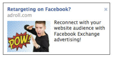
Below is an example of a good ad. The “POW” wording is unique and colorful. It grabs the eye and is effective at getting users attention. There’s also “action” in the boy’s body position and facial expression (action concept is explained more in point #7 below).

4. Gear Your Marketing Strategies To Specific Visitor Actions
The beauty of retargeting is that marketing messages can be changed based on your visitors’ actions. Target people who visit a home page differently from the way you target people who have abandoned a cart. Someone who stays on a home page for 10 seconds has very different intent than someone who abandons the cart after 10 minutes and has viewed 10+ pages. It can be effective to tie remarketing messages to specific items in the abandoned cart. It’s also effective to vary messaging if visitors abandon the cart on several consecutive occasions before making a purchase.
5. Try Limited-Time Offers
Limited-time offers create a sense of urgency and encourage people to take action. Using the example above, consumers who abandoned a cart could view a remarketing ad with a limited-time offer to encourage them to make a purchase sooner rather than later. Some limited time offer examples are:
Offer only for the first 25 people
Offer only for the next 2 hours
Save 25% — offer ends Wednesday
6. Include Specific Calls-To-Action
The key is to start with a clear marketing objective (like acquire an email address, sell a product, get a fan, etc.) and work the objectives into specific calls-to-action. Here are some example call-to-actions that you can use:
Act now
Try now
Start today
Enroll now
Get more info
Note: you could have a micro-conversion that leads to the main conversion event. For example, the micro goal could be to sell a user something inexpensive and encourage repeat and higher price-point business by targeting your new customers via email.
7. Use Compelling Images
Images are the #1 reason people are attracted to ads, and improving the image in your ads can lead to significant lift. In our testing, we’ve seen over 50% lift in ad performance from image changes. Note: images don’t need to tie directly into the product or service you’re selling, but there should be some logical connection. For example, a company in the health/wellness field can use an image of fruits and vegetables.
In our testing, these types of images tend to work well:
Healthy and happy women (shots from the waist up tend to be most effective)
Images with action, movement or that demonstrate some kind of involvement
Logos in images or incorporating words into images
Below is an example of weight loss ad using healthy and happy Jennifer Hudson. This ad is also effective as it ties into other digital media as well as offline marketing spots with the star.

Here’s a pointer: step a few feet away from your computer and see if you can see the image if you’re walking by your computer. If not, you’ll need to enlarge your image. For more image ideas, take a look at this at this article on image fatigue.
Good luck with your fatigue-proof remarketing campaign!


Comments