Smarter Remarketing: Psychological Tricks To Bring Back Abandoned Visitors
- Fahad H

- Dec 5, 2014
- 6 min read

People abandon websites for various reasons. If you’re lucky, they’ll come back to finish what they started; but more often than not, they just forget about it.
Abandoners can be hot prospects, and companies spend a lot of money trying to re-engage them so they’ll come back to the site and finish what they started.
This is done both through retargeting (paid media) and remarketing (sending a series of abandonment recovery emails) — two terms that are commonly considered interchangeable.
Whether it’s remarketing or retargeting you’re using, the goal is essentially the same: to re-engage visitors who leave before converting.
Many marketers try to lure abandoned visitors back with coupons or discounts — a risky approach because it conditions customers to deliberately abandon in search of future discounts.
There are other ways to entice visitors to return to your site that are just as effective as discounting, but not as damaging to your brand and bottom line.
By tapping into these six techniques from the world of psychology, you can tickle the buy buttons in your visitors’ brains, convincing them to come back to your site and hopefully convert.
1. Use Novelty To Re-Engage Distracted Visitors
Your visitors’ environment has a lot of distractions. They could be browsing your site when a friend’s message pops up on Facebook. Or maybe they started their transaction while on the train but were unable to complete it by the time they had to disembark.
Life is busy, and distractions like this happen throughout the day, killing countless conversions along the way.
With a highly motivated customer, re-connecting with them through a remarketing email or a retargeting ad may be sufficient to bring them back to your site.
But few buyers are really that motivated, and to capture their attention you’ll need to appeal directly to their reptilian brain — that instinctual super-processor responsible for the majority of life’s decisions.
One of the best ways to stimulate the reptilian brain is through novelty. Novelty grabs attention. In fact, the human brain is not just wired to quickly detect changes in the environment, we’re actually actively scanning (albeit subconsciously) for them all the time.
Instead of serving a generic retargeting ad, opt instead for something new and different: an eye-catching image, a simple but witty meme, or an unexpected treat that stirs your visitor’s curiosity.
If your retargeting strategy involves showing the same ad over and over again, put the element of novelty on your side by setting impression caps on each ad unit and changing the creative frequently. What’s new and novel one day will become old the next; constantly update and refresh your ad units in order to continually grab attention.
2. Give Visitors A Compelling Reason To Come Back
When a hot prospect abandons your site, your job is to try to re-create the enthusiasm and interest that they had before they left. This can be can be as simple as giving them a reason to complete the transaction (or reminding them of their original reasons for visiting your site).
Neuroscientists have observed that people are more likely to give in to requests when they’re given a justification — even when those justifications seem irrational (e.g., asking to use the bathroom before someone else in line because “I have to pee.”)
You can use the same tactic in your remarketing efforts by answering the “why” behind the expected action.
Try tapping into the inherently self-centered nature of human beings. Using the Doppelganger Effect, for instance, you can move visitors to a decision by having them visualize themselves while using your product/service.

AMC’s Dead Yourself app is the Doppelganger Effect in action. It allows fans of the popular The Walking Dead TV series become part of the show’s story as a walker.
Like most personalization strategies, the Doppelganger Effect takes advantage of the brain’s selfish instincts, evolved from the basic need for survival and self-preservation.
You can put it to work in your remarketing campaigns by creating personalized offers and using characters, stories or settings that your visitors can identify with.
3. Use Contrast To Simplify Decision-Making
Complexity and ambiguity are two of the brain’s biggest enemies. Offering visitors too many options can actually stifle their decision-making process and cause them to abandon your site simply because the decision seemed too overwhelming at the time.
Some products or services are complicated by nature. When that’s the case, rather than focus your remarketing efforts on pushing the sale, try a softer approach that supports the decision-making process.
Offer a comparison chart, an interactive wizard or app that narrows down options based on user-supplied information, or a buyers guide that seeks to simplify some of the more complicated characteristics of your product or service.
These intermediate conversion actions will help ease the mental processing required for the purchase decision, and if done well will create a clear path to purchase.
The brain loves simplicity and clear contrast. Use that knowledge to move your visitors towards action.
4. Nudge Visitors Toward Smaller Commitments
Sometimes visitors abandon because they are simply not ready to buy yet.
An eMarketer report, for instance, shows that more than half of online shoppers use a website’s shopping cart to check the total costs for their planned purchase. The same proportion of shoppers also likes adding items to their carts over several visits before they actually check out.
Although these visitors may convert later, you can reinforce their decision to buy from you by using the Foot in the Door technique.
This involves asking for small commitments from your online users first before moving on to requests that require a much larger commitment.
Instead of badgering shopping cart abandoners with numerous emails asking them to immediately checkout, ask for a micro-conversion such as providing you with feedback on their website experience, answering a quick 1-question survey about why they abandoned, or creating a wish-list for future purchases.
People like to think of themselves as consistent. Your success in getting visitors to grant a smaller request (a micro-conversion) increases the likelihood of them following through with your big conversion ask later on.
5. Reduce The Pain Of The Purchase
Are online users bailing out at the last minute even though your payment process has no obvious usability issues? It could be the pain avoidance reflex at work.
Research has shown that paying triggers the brain’s pain center. This why some users are willing to pay for Amazon Prime and other prepaid shipping programs; it helps them avoid the pain of shipping costs every time they buy something.
Moreover, payment-related pain is mitigated by the perceived fairness of the exchange — most online shoppers would rather buy more items to reach the free shipping threshold than pay for shipping fees (which has no tangible or direct benefit to them).
Your job, in that light, is to reduce the pain that users associate with the purchase. If you suspect that high up-front costs are contributing to visitor apprehension and abandonment, address this issue in your remarketing messaging.
Move potential buyers more comfortably down your conversion funnel with messaging that helps to build the value equation while easing the perceived pain of the price tag.
Provide customer testimonials and other risk reducers like purchase guarantees and third-party endorsements.
Sweeten the deal with a pricing strategy that minimizes the payment pain, such as a discounted annual fee for customers who are “total cost” sensitive, and monthly payments for buyers who might prefer a series of smaller payments to one large one.
6. Use The Illusion Of Progress To Encourage Visitors To Finish What They Started
If you’ve ever seen frequent buyer cards that have one or two items “pre-stamped,” you’ve probably wondered what kind of psychology is at work. The practice is based on a study which showed that people who were given pre-stamped cards tended to purchase more frequently than those who were given empty cards.
The existing stamps gave customers a sense of being closer to the goal, which motivated them to accumulate more stamps and complete the card.
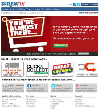
You can apply the same principle to get website abandoners to come back and finalize their purchase. First, tailor your remarketing and retargeting messages to emphasize how close they are to completing their task (e.g., “You’re almost finished” or “It’s almost yours”).

Screwfix encourages abandoners to complete their orders by reminding them how close they are to the finish line.
Next, make sure that your remarketing emails and retargeting ads take abandoners back directly to their cart. The same thing applies to visitors who were interrupted at a certain point: take them to the last page or activity they were in rather than to your homepage.
Don’t make your visitors think that they have to start from scratch — it’s not only annoying, it removes the impetus for goal completion.
The Predisposed Brain
When you look at your website data and abandonment history, you may find your visitor journeys to seem illogical.
But psychologists have shown that many consumer behavior tendencies are not only explainable, but predictable.
By understanding these tendencies, you can develop strategies that work with, rather than against, these mental processes. Knowing what makes your visitors tick is your key to developing remarketing messages that will make them click.


Comments