A brief introduction to data visualization theory for marketers
- Fahad H

- Jul 13, 2016
- 6 min read

I’ve been thinking a lot about data visualization lately and how it applies to our roles as marketers.
As marketers, it is typical for us to spend a significant amount of time working with spreadsheets and looking at, analyzing and playing with data. The final product of that data usually comes in the form of pretty charts, graphs and visualizations — and yet many marketers don’t know the principles of data visualization theory.
Let’s explore some of these principles and start making better graphs!
Why use data visualization?
Our brains are wired in such a way that we are more able to mentally process data and derive insights when it is graphed than when it is displayed in a tabular format such as in an Excel spreadsheet. As data visualization expert Alberto Cairo puts it in his book, “The Functional Art,” “[T]he first and main goal of any graphic and visualization is to be a tool for your eyes and brain to perceive what lies beyond their natural reach.”
Example #1
To demonstrate this principle, let’s look at a tangible example: a famous dataset known as Anscombe’s quartet. The data consists of four sets, labeled in Roman numerals, which each contain an x and y coordinate. In Excel, the data are very difficult to digest and to derive insight from::
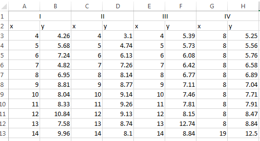
If we were to analyze these data with common summary statistics, we’d find that it looks very much the same:

At this point, there still aren’t any obvious patterns or stories that can be easily gleaned from this data. But if we graph this data using a series of scatter plots, a whole new world of insights opens up:
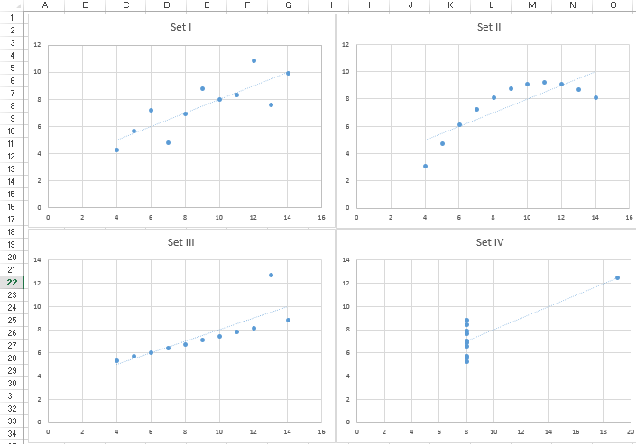
Wow! When graphed, we see some differences in the data:
Set I: Shows a simple, straight-lined linear regression.
Set II: Shows a non-linear relationship between X and Y in the form of an upside down parabola.
Set III: Shows another straight-lined regression, but with an obvious outlier.
Set IV: Doesn’t show a relationship between X and Y, and there is an even more obvious outlier than seen with Set III. All but one X value are equal to the same value, 8.
Example #2
Let’s take a look at another quick example, which is a little bit more applicable to marketing. If we have some data regarding visits to our main website and our microsite segmented by gender and age, can we easily identify a trend using tabular data?

Nothing is obvious immediately — at least not until we decide to visualize this data. There are just too many variables to process at once.
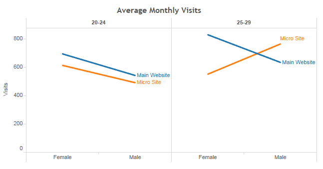
Using the data visualization, a story becomes apparent. On average, there are fewer males visiting both our main website and our microsite, for both age groups, with a single exception. For some reason, our microsite seems to be resonating with 25- to 29-year-old males more than females!
Now that we’ve explored the reasons why data visualization is an important component to data analysis, let’s explore some principles that enable us to describe our data more effectively.
The science behind choosing the right graph
Let’s quickly discuss how visual perception works. Here’s a simplified version of what happens when you look at something:
Light is reflected off an object that you’re looking at and moves through the eyes.
It filters down into the retina in the brain via its photosensitive cells (rods and cones), where it is encoded as electrical signals.
Your brain now detects basic features, also known as preattentive attributes.
The brain performs more analysis and encodes information within your memory (iconic memory, working memory and long-term memory).
Preattentive attributes
Let’s examine step 3 more closely. Preattentive attributes are certain visual properties which are detected almost immediately (less than 200–250 milliseconds) without effort or extra processing by the brain.
Preattentive attributes include:
Color
Length
Width
Orientation
Shape
Size
Enclosure
Hue
Intensity/Shade
Position
You can play with interactive examples here.
Although preattentive features are detected almost immediately, some of these features are more quickly detected than others. For example, we can detect variation in color more quickly than we can detect variation in shade or shape.
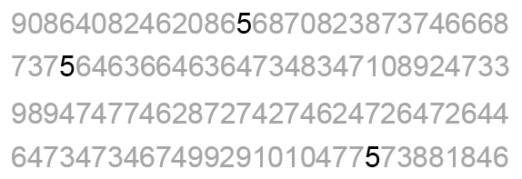
Let’s test this theory. If you are given a block of text consisting of different numbers (i.e., different shapes), how fast can you pull out each “5”? Give it shot. You can’t do it too quickly.
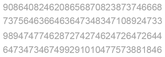
Now if we highlight all the 5s in a darker shade, we can detect them much more quickly.
We can detect them even faster than a darker shade when we make them a totally different color.
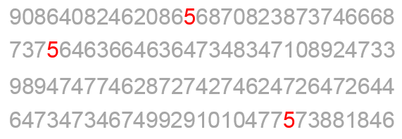
This is extremely powerful information. There are features that you can incorporate into your graphs and visualizations that basically take zero mental processing and can help improve the communication of data.
Cleveland & McGill’s research: Why choosing the right graph matters
Statisticians William S. Cleveland and Robert McGill took the concept of preattentive attributes and other research on graphical perception and conducted some of the most groundbreaking scientific research pertaining to data visualization of all time.
Cleveland and McGill developed a hierarchy of elemental perceptual tasks and ranked how accurately people were able to use them to decode data. In order of most accurately perceived to least, the tasks were as follows:
Position along a common scale
Position along nonaligned, identical scales
Length, direction, angle
Area
Volume, curvature
Shading, color saturation
Let’s explore how this hierarchy can help us choose a better visualization for a data set.
The data used in the examples below compare how much venture capital funding was received by various industries in 2010 versus 2015.
Concentric bubbles graph
Let’s start by visualizing the size and difference of venture capital funding by industry using concentric bubbles.

Now, let’s ask ourselves some questions about this graph. I’ll give you the answers later, but try to answer them without peeking first:
Which industry received the greatest amount of venture capital funding in 2015?
Which industry received the second most amount of venture capital funding in 2015?
If you had to guess, what percent of funding did the Biotechnology industry receive in 2010 compared to 2015?
If you had to guess, what percent of funding did the Media and Entertainment industry receive in 2010 compared to 2015?
Make note of your answers and ask yourself the same question when looking at the next graph. It’s the same data represented differently. Do your answers change?
Bar Chart #1

Let’s try this exercise one more time. Again, it’s the same venture capital data, just represented in a slightly different graph.
Bar Chart #2

I suspect your answers have changed — or at the very least, you have grown more confident in them. Each iteration of this graph was improved using information from the Cleveland and McGill hierarchy and made use of perceptual tasks that you are more easily able to decode.
Here’s the last graph, Bar Chart #2, including the actual values.

Question:
Which industry received the greatest amount of venture capital funding in 2015?
Answer:
Biotechnology.
This was the easiest question to answer, since you were able to tell even when it was depicted using the concentric bubbles graph. It was however, significantly harder with the bubbles than with the different bar graphs, because the bubble graphs primarily made use of “area,” which is much harder for us to perceive than “length.” We also have a particularly difficult time perceiving the area of circles, so our perceptual task was further hindered by the graph items’ shape.
In Bar Chart #1, we were making use of “length.” But Bar Chart #2 was easier to read because it used “Position along a common scale,” allowing you to truly see how much more funding Biotechnology received than the other industries depicted in the data set.
Question:
Which industry received the second most amount of venture capital funding in 2015?
Answer:
Consumer Products and Services.
This is much more difficult to see using the concentric bubble graph. The amount of venture capital that the Consumer Products and Services industry received ($4,800 M) is very close to what the Media and Entertainment industry received ($4,749 M). Area is particularly difficult to decipher when we’re comparing multiple similar values.
Bar Chart #1 isn’t an optimal encoding of this data either. It uses “Position along nonaligned, identical scale” (second best on the Cleveland and McGill hierarchy) represented as small multiples, which isn’t as good as encoding it as “Position along a common scale” (best on the Cleveland and McGill hierarchy), as represented in Bar Chart #2.
Question:
If you had to guess, what percent of funding did the Biotechnology industry receive in 2010 compared to 2015?
Answer:
Fifty-four percent. In 2010, Biotechnology received $3,984 M in venture capital funding, whereas in 2015, it received $7,408 M in venture capital.
This is nearly impossible to identify with the Concentric Circle Graph, because of its use of Area (fourth best on the Cleveland and McGill hierarchy). Most people will incorrectly say around 80 percent.
Question:
If you had to guess, what percent of funding did the Media and Entertainment industry receive in 2010 compared to 2015?
Answer:
Thirty-four percent. In 2010, the Media and Entertainment industry received $1,624 M in venture capital funding; in 2015, it received $4,749 M in venture capital.
As with the previous example, it is very difficult to correctly identify the proportions using the concentric bubble graph. Humans are not that good at perceiving differences in area, especially of circles. Most people will incorrectly say around 50 percent.
Conclusion
Data visualization is part art, part science. There is no correct way of visualizing a single piece of data, but there are some concepts we can apply to make more effective graphs and visualizations. I’ve given an overview of some of these concepts, explaining the preattentive attributes and how to leverage to Cleveland and McGill’s perceptual hierarchy.
The next time you create a chart in Excel or craft a report or presentation, think about these concepts, and make your data visually soar.


Comments