MySpace Is Back. Again. This Time With A Super Sleek Music-Oriented Look
- Fahad H

- Sep 25, 2012
- 1 min read
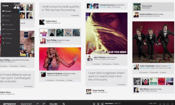
It’s been four years since MySpace has been relevant as a social network. Despite the mass community exodus to other social networks, the new Justin Timberlake-led ownership team is still attempting to revive it. A new teaser video was released yesterday that gave users a sneak peak at an upcoming redesign:
While the design is clean & ascetically pleasing, but the focus seems a bit all over the place. My initial thoughts were that Justin Timberlake threw Google+, Pinterest, Last.fm and Spotify into a blender and made some sort of social media slushy. The video has strong focus on music, including playlists, a media player, magazine style music-based content and concerts/events. The look is very sleek and features horizontal timelines, videos that play full screen and huge photo galleries.

Music has been one social niche that MySpace has been clinging to. Bands could create playlists for users and display event calendars. It was easier than creating a full website for many. Thankfully the redeisgn sticks to the musical core. To me, the social social updates like user statuses, photos and Tweets seem unwarranted and cloud the music-oriented platform. The time for MySpace as a stand alone social network has come and gone. Additionally, this sleek new look might just be too much for users though as Twitter and Facebook are painfully simple.
Certainly the redesign isn’t going to instantly win back market-share, but this new redesign may well be a valid marketing tool for those in the music/entertainment business. Those with a need to list songs, videos, events and playlists quickly shouldn’t overlook this.
To sign up head over to new.myspace.com and enter your email address for an invite.


Comments