Mobile In The Wild: A Look At Amazon Emails
- Fahad H

- Jun 13, 2012
- 4 min read
Mobile email is no longer coming soon. It’s here, and it’s here to stay. Mobile-friendly tactics like single column, large text, and big tappable buttons have entered the industry’s collective list of best practices. Skinny emails and @media are a far cry from standard, but it’s much easier to find an example in my inbox each day than it was even a few months ago.
To illustrate that point, I nabbed a few messages from my inbox. Amazon has been making impressive strides towards a mobile-friendly email program over the past few months.
I’m seeing skinny messages, responsive designs and an overall move toward greater mobile awareness. The set of messages presents a great opportunity for learning, so I’d like to share visuals.
All emails in this article come from the past month (~May 8 – June 4, 2012).
Promotional Email
Here’s a straight promo email, this one aimed at Father’s Day shopping. This email shows mobile friendliness in two important ways. First, the layout falls into the skinny category, at ~480px wide. Second, the images are all product shots against a white background, creating easily recognizable silhouettes and natural touch targets.
Cart Abandonment Email

Here’s a more dramatic mobile-focused email. The width sits at a decidedly skinny 320 px with a clear and touchscreen-ready call-to-action (CTA) button.
At the same time, the sheer number of options in the link bunker at the bottom of this message can be difficult to navigate on desktop, and even more so on mobile. A focused set of links, centered around the product category of the hero item, would likely better capture the energy of the abandoned purchase.
Product Recommendation Email

Besides uncannily intuiting my video games tastes, this product recommendation email expands on the previous message’s format. “Learn More” makes a surprisingly passive call-to-action compared to the experience on Amazon’s site. Still, the buttons create a proper visual hierarchy, with the primary call-to-action on a strong color background and the supporting call-to-action on a neutral background.
Despite my enthusiasm for mobile-friendly approaches, I have to admit that viewing this email on a desktop feels a little off. While the mobile-focused layout doesn’t detract from the desktop experience, it does feel out of place.
An email aimed at desktop users would have larger product images and heavier graphics overall, so, to achieve the optimal aesthetics and experience, a responsive design would be a good solution.
Amazon Local Daily Emails

I include these Amazon Local examples as an interesting point of comparison between the approaches on mobile email (left) and the mobile website (right). The email is fairly standard daily fare and could take a few lessons from the mobile site.
Content consumption occurs daily, so immediate focus on decision-driving info is key – a combo of the emotional/logical drivers of image and price pushing towards an easily-tappable CTA. The email could be improved by placing greater prominence on the headline, price/savings, and CTA button.
Kindle Daily Deal Emails

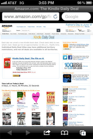
This daily program promotes daily deals in the Kindle store. Paradoxically, there’s little mobile friendliness in either the email or the Kindle store site to which it directs us.
There is a mobile-friendly version of the Kindle store that I can navigate to via Amazon.com, but that experience isn’t replicated if I click from an email on the very device where I use the Kindle app.
The email does feature easily-recognized images, but key information — book title, price, savings — is buried in a paragraph of copy. Likewise, the CTA is passive and small, and upon clicking I’m taken to a site that doesn’t recognize my device.
Responsive Emails
Amazon’s also toyed with a few great responsive examples. The image below shows a single email viewed on desktop (left) and mobile (right). Content remains the same across both versions, but a graceful construction and some clever @media coding allows a wider-than-usual (~750px) email to reformat into an easily readable single column.
Compare the two and you can see how careful planning and modular elements transition between layouts quite easily. That modular nature is as simple as self-contained, non-overlapping rectangles.
So long as content blocks can either easily resize (as with the hero text and image), easily stack (as with the primary and secondary content), or easily reflow within a resized container (as with the date range/CTA content), they make a great foundation for a responsive message.


Print & Email
Let’s step away from mobile for a moment and look at another channel overlap: the print and email points statements for the Amazon Visa program. Each element, down to the copy, is almost exactly the same but the email design is differentiated in a few ways:
The contrast in the header graphic, as wells as the white email body on a gray background, anchor the top and bottom of the email. This creates a consistent frame across the multitude of potential inboxes it may be viewed in.
Contrast and background color in the body also make the email slightly easier to scan.
As you’d expect, the email features a CTA button rather than a call to visit a URL.
Unfortunately, the two most important pieces of information — the points total and the CTA — are buried nearly at the bottom of the email. Bringing these up to be immediately visible would have created interest and urgency more strongly.


As a designer, it’s been a blast to see brands experimenting with the convergence of email and smartphones. None of the emails here are graphically complex, but the exploration here is a lesson we can all use.


Comments