Learning By Example: 9 More Responsive Emails
- Fahad H

- Nov 28, 2012
- 4 min read
A few months back, I wrote a post outlining four responsive emails and the tactics they applied to content. I’ve received significant feedback on that post, so I’m diving back in to show some more responsive emails from my inbox. There’s a range of ideas here, from beginner to advanced tricks.
It’s important that we all be looking at examples of what’s happening in the space. There are few best practices established, and fewer quick fixes. The phrase “mobile optimization” is being tossed around a lot, but the idea is new enough that I don’t think we quite know what it means yet. There’s no light switch for addressing mobile inboxes, but these examples are a great place to keep learning from those who are paving the way.
Let’s jump in.
Note: The only edit I’ve made to these images is to cut off footer text on some messages, as it took up space without providing additional insight.
1. Campaign Monitor Newsletter
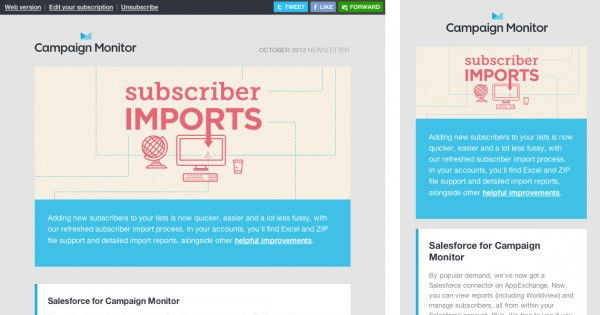
Campaign Monitor was one of the first to embrace responsive email, and their newsletter remains one of the most graceful examples of transitioning from a desktop to mobile state. It’s a perfect example of maximizing readability.
Notable tactics used in transition from desktop state to mobile state:
Preheader (and a few footer) elements hidden
Email shell (usually called the “template”) resized to be narrower
Text reflows in skinnier layout
2. Hilton HHonors
I mentioned a Hilton HHonors email in my previous post, too – they’re consistently using responsive email and slowly trying new things. What’s interesting here is the hero image. It’s the same across both views, but used in a slightly different way. Note the image appears to wrap around the body column on the desktop view, while it’s simply full width on the mobile view.
Notable tactics used in transition from desktop state to mobile state:
Preheader hidden
Account module hidden
Shell resized
Footer logos hidden

3. Salesforce.Com Developer News
This Salesforce email is notable because it represents an emerging trend among responsive emails. A number of elements are adjusted in the mobile view, but the main point to note is how the right column of the body floats under the left column. No other significant adjustments are made, so this is purely a readability move.
Notable tactics used in transition from desktop state to mobile state:
Right column floats under left column
This approach is one of the ways brands are retro-fitting old designs to be more mobile-friendly without redesigning. It certainly shouldn’t be labeled as “optimizing” for mobile, but it’s a step forward on improving readability.

4. Rewards Network | Delta SkyMiles Dining
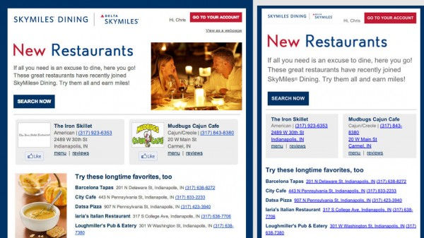
This email shows a restrained use of the mobile view. Again, the primary goal here is readability on mobile. The main tactic in place is simply hiding images to provide faster access to directly actionable information.
Notable tactics used in transition from desktop state to mobile state:
Images hidden for easier reading
5. HTC Newsletter
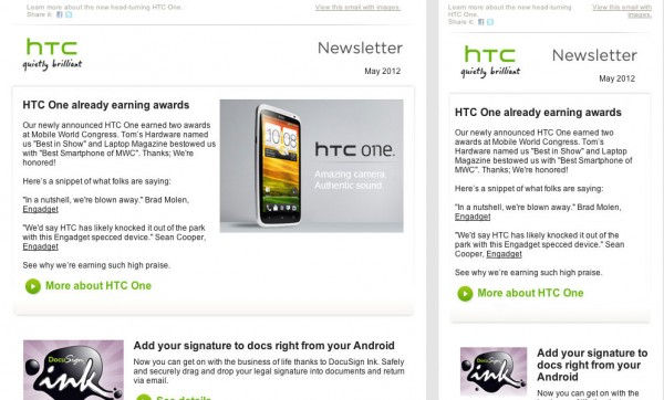
Another simple but effective example can be seen here. A single image is hidden and the width is adjusted to ensure readability on small screens.
Notable tactics used in transition from desktop state to mobile state:
Hero image hidden
Shell size adjusted
6. AT&T: Add A Line Promo
Here’s a slightly more advanced version of the floating we’ve seen in other emails. There’s been ample planning for both a wide-format/desktop view and a narrow-format/mobile view so no content needs to be hidden.
Notable tactics used in transition from desktop state to mobile state:
Content floats (hero info under hero image, body info blocks next to body images
Phone number call-to-action (CTA) becomes a button
Footer links float and become full width

7. Seagate: Windows 8 Announcement
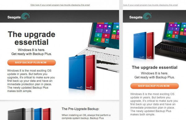
We see more of the same in the Seagate email. There’s one instance of floating in the hero content, and images are hidden to keep the content readable. The notable difference here is in the hero image – look closely at each view. See how the external drives shift their position? There are two different images here: one for the desktop view and one for the mobile view.
Notable tactics used in transition from desktop state to mobile state:
Hero content floats
Hero image replacement
Body images hidden
8. Starwood Preferred Guest News
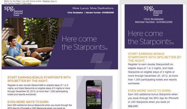
SPG provides another example of floating, hiding and replacing, this one slightly more complex. In the mobile view, the header loses an image that wasn’t particularly impactful and reads much faster. The changes made to the footer – simple, distinct and made for touch – make for a great closing to the mobile view. As brands are starting to develop mobile-friendly templates, I think we’ll soon start seeing a lot more headers and footers of this type.
Notable tactics used in transition from desktop state to mobile state:
Header and hero elements hidden
Right body column floats under left column
Footer links reformat to be instantly readable and easy-to-tap
9. ModCloth
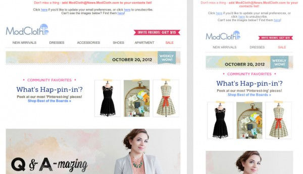
I like this example not because ModCloth has done anything particularly different from the other examples or employed a tactic not seen elsewhere, but because the transition is so seamless. In many responsive emails the mobile view feels forced or an obvious retrofit, but this mobile view looks every bit as well planned and constructed as its desktop counterpart.
Notable tactics used in transition from desktop state to mobile state:
Preheader stays, but the nav is reduced
Scaling and floating throughout
Some hidden elements in the body and footer
Looking Forward
The ModCloth email, especially, is a good indicator of where we’re heading. Strong consideration is paid to both states of the responsive layout, and content is designed for the transition rather than one state or the other.
I’ll be back next month to take a step back from the examples and start thinking about layout patterns and trends. If you have thoughts on these emails or are seeing other emerging ideas on responsive messages, drop a line in the comments.


Comments