Graphing trends can make you better at calling A/B tests
- Fahad H

- Jul 14, 2016
- 7 min read
An
A/B test is designed to be binary. We want to know if one of our ideas results in an improvement in performance and advances our fortunes, or if it is a dog that lowers results.
A purist will tell you that there is no reason to look at test results until statistical significance has been achieved. Thank you, Purist.
However, there are other concerns to consider when a test is running. Trend graphs can help you determine when to call a test “done” and when to keep it running.
Is this test too expensive?
There is a real cost to testing. When one or more of your ideas is underperforming the control, you cost yourself leads, sales and revenue.
When looking at the following graph from the A/B testing tool Marketizator, can you tell if any revenue is being lost by the Variant A and Variant B?

Can you tell which of these variations is winning?
It appears that the orange line, the Control, is outperforming our Variants. But things seem to be changing on and after July 4. Maybe our Variants are patriots. Is either of our variations winning?
To understand the trend, we can look at a cumulative graph of revenue per visitor.

Cumulative graphs help us see long-term trends in the data.
This cumulative graph lets us see the trend. Here it looks like the Control has pulled far ahead of our Variant A and Variant B. Now, this is looking like an expensive test. We will see that this trend may be misleading.
There is also an opportunity cost of testing.
Should we be testing something else?
When you are waiting for a test to come to that magical statistical significance, you aren’t testing something else. So any test you’re running has an opportunity cost.
Some tests never reach statistical significance
If you test a variation against the control, and it performs almost the same, statistical significance will never be achieved, at least in your lifetime. Can you tell if either of these variations has a chance to beat the other?

It’s hard to tell if these variations are performing similarly.
They look close, but when you look at the cumulative graph, the situation looks pretty dire.

The Cumulative graph makes it pretty clear that these variations are performing similarly and may never reach statistical significance.
These two variations may never reach statistical significance because they are just too close together. Do you think you should stop this test in favor of another? Before you decide, let me show you how I created these cumulative graphs.
The cumulative time series graph
The formal name for the trend graph is a cumulative time series graph. It is a time series graph because the x-axis represents time. It is cumulative because each point includes past performance. The data accumulates as the test runs.
Many A/B testing tools provide a cumulative graph of test results so that we can see how our data is trending. However, it’s dangerous to judge results by looking at these graphs.
How dangerous?
Here’s a cumulative time series graph showing two identical pages. We call this an A/A test. It’s used to understand if there are any errors inherent in the testing implementation and to determine how long it takes to reach statistical significance. If everything is working, the difference in performance between these two “variations” should be close to zero.

This graph seems to insinuate that our A/A Test has gone wrong.
Clearly, they are not. The difference is almost 32 percent after the first two days of testing. To our eye, this looks like a failure.
This is the seductive nature of trend graphs like this. However, when this ran for an additional nine days, the lines came together.

If this test had been stopped sooner, we would have “learned” the wrong thing.
A 3.5-percent difference is an acceptable margin of error for an A/A test. Notice that things looked dire right up until the 26th.
The moral of the story is to take trending reports with a grain of salt. They are called trending reports because they slow down the changes in the data. What you’re seeing is where the data is going, not where it will end up.
Creating a cumulative graph
The sources of A/B test data come primarily from an A/B testing tool or your analytics software. If all is going well, you will know how each variation performed during your test.
If your site is generating leads, you’ll have a list of completed form fills or phone calls and the date of the transaction. If you’re optimizing an e-commerce site, you’ll have a list of transactions with the amount and date. Our goal is to transform this data into a cumulative time series.
Here is an example of the kind of data you might get from an A/B testing tool.

The kind of data you get from an A/B testing tool.
Our challenge is to group the data by time — daily is typical — and by variation (Control, Variation A, Variation B). Excel provides a wonderful tool called a Pivot Table that will do most of the hard work for us.
Most A/B testing tools integrate with analytics packages, like Google Analytics. At Conversion Sciences, we create custom reports that give us the data we need by day. You can re-create this Activity by Day Report here.
We filter our data using Advanced Segments that report which visitors were in which test variation. Here we call these segments “Variation A” and “Control.”

A Google Analytics report that gives us performance data for test variations.
We’ll pop this into Excel with a simple export.

Export a Google Analytics report to Excel.
The “Dataset1” tab of the exported spreadsheet has our data in it by date, separated by Segment.

Test data exported from Google Analytics
Step 1: Normalize the data
First of all, we need to put our dates into a day format. Everything from 6/23/2016 should be grouped. We don’t care if a transaction happened at 12:25 or 18:03. We’ll convert the data in “Date created” to just the day portion of the date.
There are a number of ways to transform a date. I usually use the Excel date functions to create a string that identifies each date. Here’s the string I use to convert a date into a date string that we can use.
=YEAR(A13)&TEXT(MONTH(A13),”00″)&TEXT(DAY(A13),”00″)
The date 6/23/2016 12:25 becomes the day ID string 20160623.
We don’t need to do this for Google Analytics exported data, as Google writes the day as a string for us.
Step 2: Pivot the data
The marvelous invention called the Pivot Table lets us group this data by Variation and by Date. We select our table of date and Insert > Pivot Table.

Configuring the pivot table for test data.
Now we can switch between our variations and copy our day-ized and variation-ized data to a spreadsheet for graphing.

One table of data for each variation, organized by day.
I move the columns around to group them like this:

Reorganizing the columns helps with graphing.
Now we can add our “Cumulative” columns for our trend graphs. In these Cumulative columns, I’m using Excel’s SUM() function and a little trick.

The trick is the $ in front of the first “6”.
By placing the “$” in front of the “6” in this case, I can drag the cell down to get the cumulative summing of the value.

Each cumulative point sums the previous data points.
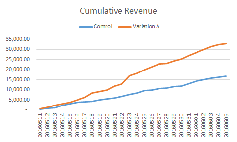
Repeat this for the Revenue for Variation A. When we plot the graph, we get a smooth trend for the data.

A cumulative graph smooths the data, making it easier to see trends.
It’s pretty clear from this graph that Variation A is kicking the Control’s butt, or so it seems. Did Variation A get considerably more visitors than the Control? It’s not apparent from this graph. A better measure of performance is Revenue per Visit, or RPV. This is the revenue version of Conversion Rate.
We have captured Sessions as a part of our data, so we can calculate RPV. As the metric hints, this is the Revenue divided by the number of visits, called Sessions in Google Analytics.

Calculating cumulative revenue per visit is easy when you have cumulative revenue and cumulative sessions calculated already.
When we graph the cumulative RPV, we see the Control and Variation settling into a level, with Variation A generating much more revenue per visit.

The trend in revenue per visit (RPV) is that Variation A is likely to win.
In this test, Variation A is likely to win. This is 26 days of data and less than 300 transactions per variation. This is not a statistical lock. However, given the size of the gain, we may well call Variation A the winner and move on to another test.
Things aren’t always this obvious, however.
Moving average
There is a similar calculation you can do that doesn’t “smooth out” the data quite as much. You can see trends but also detect changes in the data. This is called “Moving Average.” Each point on the graph is the sum of the last “n” data points. The bigger “n” is, the smoother the graph.
Remember our example at the top of this column? That, too, looks like a runaway success for the Control.

Cumulative graphs help us see long-term trends in the data.
It looks like our Variations are costing this website some significant revenue. However, this is only about two weeks of data, so we wanted to get a better perspective. Is it possible that this data is turning? To find out what the more subtle trends are, we applied a four-day moving average.
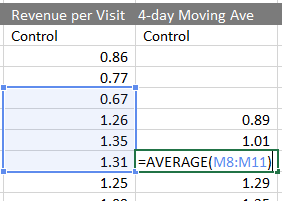
As it sounds, each point is just the Average of the past four days of Revenue per Visit. I calculate using the Excel AVERAGE function.

Using Excel to calculate a four-day moving average graph.
When we apply this to our data, we see the more recent trends.

Four-day moving average graph of test data
Here, it appears that RPV for the Control is trending down a bit while Variations A and B have trended up since July 1. This wasn’t visible in the daily and cumulative graphs. In this case, we’ll recommend continuing the test until a larger sample size has been captured.
Using data to walk the line
It’s important to call an A/B test a loser when it is costing you revenue. However, calling it too soon may cause you to make the wrong decision.
Using these trending graphs can help you walk the line between statistical patience and unnecessary expense.


Comments