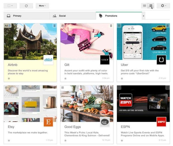
Gmail Promotions Tab Gets Visual Punch: Google Testing Image-Driven Grid View
- Fahad H

- Mar 25, 2014
- 2 min read

Source: Google
It’s like Pinterest for your inbox. Today, the Visual Web is coming to email with Google’s latest test of a grid view in the Gmail Promotions tab. The grid presents marketing emails in a “pin-like,” image-driven fashion by surfacing images within emails and displaying them right in the user’s inbox.
The images — now cached and delivered from its own servers — thanks to Google’s move at the end of last year — are displayed along with brand logos and names and the traditional email subject lines. The emphasis in the grid view, though, is on the image first, offer second.
Currently, email marketers put everything they’ve got into crafting and testing subject lines that will get users to notice and click on their emails. If this new visual format takes hold, the images marketers choose to showcase in the grid will be as important, if not more so, as the offer itself in determining Gmail open rates.
There was much consternation in the email marketing world when Google introduced the tabbed inbox that corrals marketing emails in the Promotions tab (for those users who enable the tabbed view). Would users even pay attention to this new tab, or would they ignore it like a pile of junk mail?
Four months after the tabs debuted, email data provider Return Path published a study of 3 million Gmail users’ inboxes showing that read rates for commercial emails — 90 percent of which went to the Promotions tab — had held fairly steady.
Return Path also advised that marketers stop sending so called “Move Me” emails requesting that users to move their messages to the Primary tab. If this grid test performs well, we could start seeing “Move Me Back” emails.
It’s this tabbed functionality that now allows Google to experiment with new ways of presenting commercial emails to users.
The Promotions tab also gives Google new ways to present ads in Gmail. You can see in the grid example above that the sponsored promotion ads — this one for Arbnb — that the same treatment of yellow shading and “ad” slug carries through to the grid view. However, upper left positioning in the grid is much more valuable real estate than the top spot in the traditional list view.
Gmail users can sign up to participate in the test starting today. Participants will be able to toggle between the traditional list view and grid view within the Promotions tab. The test is limited to desktops at this point.


Comments