Foursquare Packs More Information Into Redesigned Business Profile Pages
- Fahad H

- Apr 23, 2013
- 1 min read
On the same day that Facebook
introduced a new mobile Pages layout, rival Foursquare is changing the look and organization of its local business pages (on the PC though not in mobile). The new design is intended to provide more useful information at a glance.
Among the features of the new page design are the following, according to Foursquare:
Places are easier to scan and find all the useful information you need, like the address, phone number, hours, the menu, and upcoming events.
View beautiful photos, tips, and the rating from the Foursquare community. We highlight the things people talk about the most and make it easier to search for specific tips.
You’ll get even better personalized insights when you’re deciding where to go. See which of your friends have been before and what they’ve said about it.
On the right side, you’ll see suggestions for similar places. Since you may be looking for something to do afterwards, we’ll show you a few other places that people like to go.
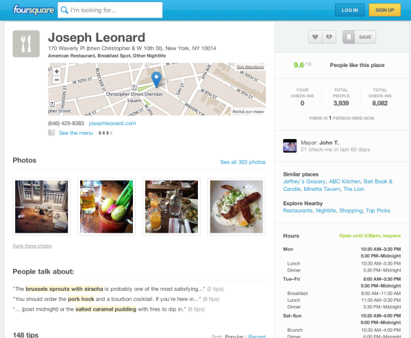
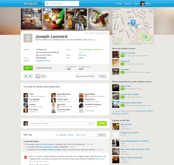
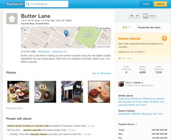
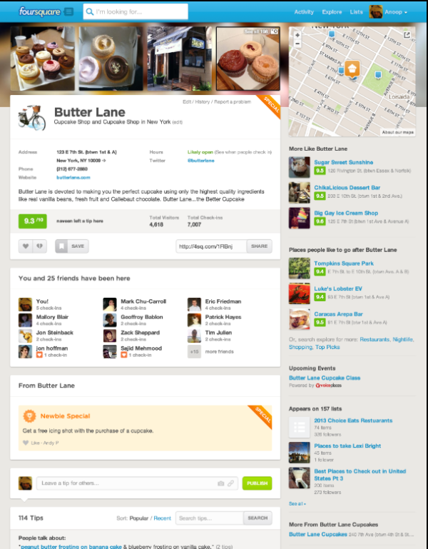
Below are some before and after examples of two local business pages in New York. The new pages are denser and more information-rich above the fold.
Example 1 current page:

Here’s the updated version of the same page:

Example 2 current page:

And now, the new version of that same page:

Some people might lament the density of the pages and the loss of “whitespace.” However, I believe the changes add greater utility for those using Foursquare to find local business information. The company, which recently secured another $41 million, says that it has 50 million monthly unique users.


Comments