Email Marketers Aren’t Ready For Gmail’s Grid View, Yet: What You Need To Know To Stand
- Fahad H

- Apr 2, 2014
- 3 min read
Google is very good at forcing an issue. The company knows visuals are increasingly important for user engagement, so last week, it began testing a new image-rich grid view in the Gmail Promotions tab. The move to make images a key part of the email open rate equation should in turn compel marketers to pay more attention to the images they use in their campaigns.
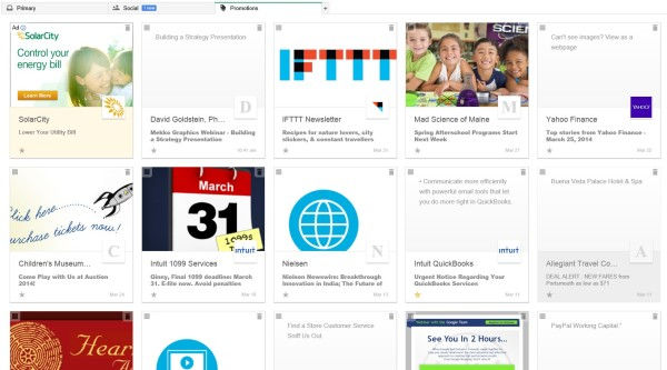
I described the new view as Pinterest for your inbox based on the beautifully styled preview Google provided. Not surprising, however, many marketers aren’t quite prepared to show off their finery, and users aren’t being treated to a wealth of visual eye candy just yet.
Here’s what my grid view looked like yesterday — lots of white space where images are supposed to be and very few logos showing up in the thumbnails.

Gmail’s Promotions Tab Grid View In Reality
“Gmail’s new grid view means images will have more impact in the open/delete decision. Broken images, poorly-aligned images, and/or no images may mean your email gets ignored,” DJ Waldow, Marketo’s Digital Marketing Evangelist says.
“Images have the power to make a reader stop, pay attention, and give an email a second look,” says Ron Cates, Constant Contact’s Director of Digital Marketing Education. “The new Gmail layout gives marketers the opportunity to really stand out and catch readers’ attention by keeping your images front and center.”
After Gmail introduces the tabbed inbox last year, users became more, not less, active. According to YesMail Interactive, in Q4, 19 percent of Gmail subscribers had been active within the last year, compared to 10 percent for AOL, 12 percent for Hotmail, and 14 percent for Yahoo.
YesMail’s director of market intelligence and deliverability, BradVan der Woerd believes this latest test will make it easier for subscribers to decide whether a promotional offer is relevant, and give marketers more control to make their messages visually appealing and relevant to their subscribers.
Start Testing
Marketers should be testing their emails in grid view now, say email experts. Van der Woerd recommends marketers sign up for the field test to be able to start testing how emails render in the new view.
Waldow stresses testing to ensure emails look good in a variety of email clients and devices and suggests marketers “segment your list by domain and send a different version of your email to Gmail users.” Waldow adds the caveat that because the grid view is only available on desktop now, it won’t have any impact on the growing number of users accessing their email from mobile devices.
Understand The Formatting Requirements
When it comes to the formatting elements for the grid view, the featured image must be at least 580px x 400px. The thumbnail logos are pulled from a brand’s verified Google+ page — yes, another way Google is weaving Google+ into the fabric of its various products.
Also note that sender names are limited to 20 characters before being cut off, and subject lines are truncated after 75 characters.
Monitor The Competition To Stay Ahead
To maintain your edge, van der Woerd suggests keeping a closer eye on your competitors. “If some competition has fallen behind and their promotional offers aren’t rendering properly at all through Gridview, you can take full advantage by being prepared and having your promotions look flawless within the inbox.”
Van der Woerd adds that when the grid view is available to all users — and he said when not if — marketers should pay close attention to how open and click rates are trending with their Gmail subscriber base. “This is going to be a critical step to properly knowing your audience, and gauging whether or not your promotions are coming across the way you’ve intended them to within Gmail’s Grid View.”
Fundamentals Matter
Cates adds that while it’s too soon to know what the end impact will be of the grid view, it is always smart to use images as part of email marketing efforts. “Marketers should strive towards delivering meaningful content and also beautiful, relevant images in their email marketing campaigns.”
The fundamentals still remain important, of course. Waldow concludes that “earning the trust of your subscribers will still be the number one way for marketers to stand out. Timely, targeted, relevant content trumps all else when it comes to getting subscribers to engage with your brand’s campaigns.”
Postscript: Be sure to read columnist Tom Sather’s hands-on advice his latest post, How Email Marketers Should Mark Up Messages For Gmail’s New Grid View


Comments