A New MySpace Relaunches (Again) On The Back Of Justin Timberlake’s First Single In 7 Years
- Fahad H

- Jan 15, 2013
- 2 min read
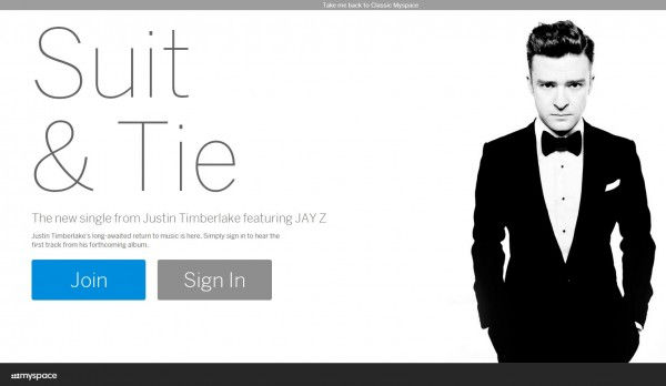
With big news on the Facebook front, MySpace picked tough day to get traction around their new product. However, they did muster up one hell of a promotional tool in the form of investor Justin Timberlake’s first single in 7 years. The track, Suit & Tie, features Jay-Z and is exclusively streamed on the updated social network.

Will JT’s massive exposure and traffic be enough to bring back interest in MySpace? Probably not. But the new look is visually stunning and the features are quite nice. From login/sign-up to browsing music, the UI is slick and the overall design is extremely appealing. But, it’s MySpace. — arguably the biggest flop in social media history.
Newscorp bought the flourishing network back in 2005 for $580 million and in 4 short years a Justin Timberlake led group purchased it for just $35 million — just 6% of the initial price tag. That’s a stink that’s hard to remove. Here’s the thing, if this new site was named anything but “MySpace” a lot of folks would be buzzing about it as it’s executed well and fills a very specific niche. Here are some of the key features.
Appealing Design
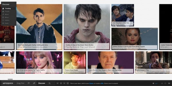
In one word the new MySpace design is “hip.” With rarely seen horizontal navigation, slick javascript execution and huge vivid images MySpace just looks good. while feeling genuinely different. It’s not just a cover photo design ripped off from top social sites like Twitter/Google+/Facebook. The left navigation is minimalist and easy to use while the lower playlist is unobtrusive.

Made For Music
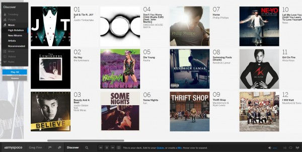
Where the design really stands out is on user profiles that listen to a variety of music on the site. With Facebook profile pages and the ticker, social sharing is really an afterthought of the design. MySpace was made for music. Whether it be on music displays on user profiles, musician pages or music trends — it beats all other sites hands down.

Where I believe it will have the most success is as a music-oriented social network. Avid music fans can find new music, share their plays in a tasteful fashion and follow artists on a site where media comes first.
Tumblr-Like Updates
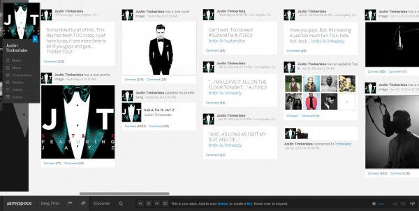
One of the areas where the horizontal navigation becomes cumbersome is on the text-heavy profile pages. If music hasn’t been play recently, or new friends or photos haven’t been added the unorthodox text is a bit daunting to consume as the eye naturally moves left to right when it should be moving up and down columns.

With music, mixes, photos and events the new MySpace would make for perfect landing pages for musicians/comedians and entertainers. However, the biggest obstacle that MySpace will have to hurdle is the relative un-coolness associated with the site. In our office people audibly shuddered when logging back in thanks to memories of epileptic animated gif backgrounds and auto-played music. That said, once they saw the features and implementation, they were impressed. Here’s to hoping that others can get past the stigma as well.


Comments