What Does Feature Creep Look Like?
- Fahad H

- Jul 11, 2013
- 3 min read
When you think about feature creep and bloated products what comes to mind? Endless tabs, toolbars, settings, and preferences, right?
For a 5 year period you couldn’t sit through a UX talk without seeing some variation of this infamous Microsoft Word screenshot as example of the need for simplicity…
Poor UI such as that above highlights the cost of feature creep. There is simply too much stuff for users to comprehend. The problem is that horrible screens like this don’t inform you about what to do next. Sure there’s too much shit on the screen, but what do you do about it?
To solve feature creep you need to identify which features are being adopted by everyone, and which ones are struggling to gain traction. This is deceptively simple to do.
Analyse Adoption per feature

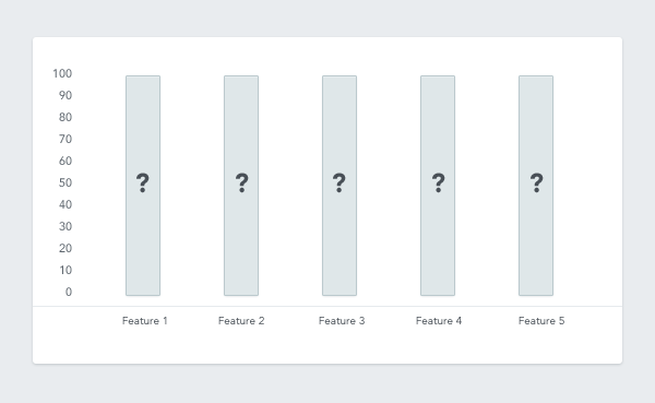
The X axis is each feature in your product and the Y axis is the percentage of customers1 who are using2 the feature3. Let’s clarify those three terms:
Customers: Which customers? These should be active, paying, accounts. By ‘active’ we usually mean 30 Day Active. Dead customers give you bad data, so don’t count them. By paying, we simply mean they should be paying to use your service. Lastly by accounts we mean that you group users together by the company account they’re on. For example, a product’s reporting features could only be used by one person in a company, but that’s still one paying account using the feature.
Using: What does it mean to use a feature? There’s a difference between using a feature, and trying it out once. Almost everyone has tried Google Plus, and hence would pass any “status_updates > 0” filter. Be careful to filter out people dipping their toes, from people using it plenty. In my experience of applying this, usually changing the 0 to 3 solves 80% of this problem.
Feature: What features should we include? You should apply this to every feature you believe customers should be using. Things like account maintenance, password reset etc, should be excluded, as they’re table stakes edge case features.
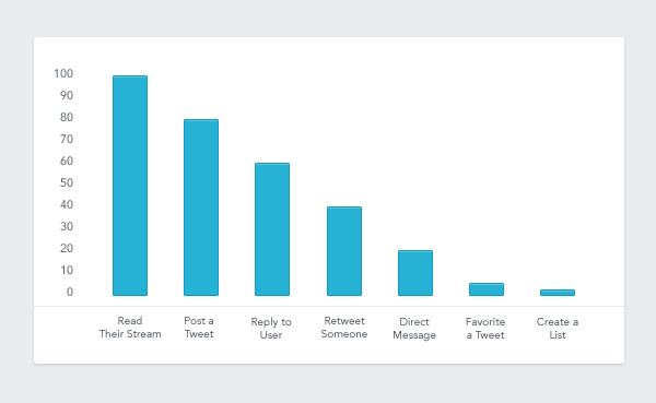
Products with a relatively small amount of features should aim for good adoption per feature. For example, Twitter might look like this:

This is simple but powerful way to analyse usage. It quickly shows you the main values of the product. It also highlights any opportunities to hide, or kill features. For example, the twitter list feature could be a candidate for removal here, or at the very least it shouldn’t be exposed on primary screens (which it isn’t).
The strong rate of adoption for almost every feature in this example lets us say that Twitter is well defined product with only a couple of rogue features that should probably have never been built.
Feature Creep Visualised

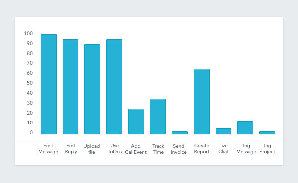
When you have any type of long tail of features that have little usage, you’ve gone off course, or your strategy is “build everything that everyone wants”. The latter might sound crazy, but products like Microsoft Word have very done well with that plan. But you’re probably not building Microsoft Word. If you want a well defined product, you must be comfortable killing features.
Fish or Cut Bait

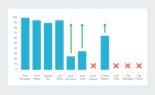
Features struggle for adoption for lots of reasons, users don’t see the value in using it, they find it too complicated, it’s hidden somewhere clever in your product, they’re the wrong type of users, and dozens more. This is why it’s important to say no. When you’re faced with a feature that only 8% of your user base are using, you have to make a call: Kill it or Keep it.
Killing a feature can take many forms, you can hide it from new users, message current users to explain your decision and give them time to prepare. Or you can just tear it out of the UI and never mention it again. Both work, with varying amounts of overhead. The bigger the product, the less you get away with dramatic moves.
Keeping a feature that has no adoption requires design & communication. You need to target the users who are using it, and work out why. Target some users who aren’t, and work out why. Obviously this is where a tool like Intercom shines as you can target the users and start the conversations in seconds.
Often you’ll find simply promoting the feature through in-app messaging works. We’ve worked with customers who have driven up to 30% increases in feature adoption simply by messaging the right type of users at the right point in their lifecycle. Similarly we’ve seen customers get enough raw feedback from customers to make it clear that a feature simply isn’t valued, which makes its removal painless.
Good product owners let in very few dud features. Great ones kill them on sight.


Comments