Visual Content: The Potential and Pitfalls of Parallax Design
- Fahad H

- Oct 7, 2013
- 5 min read
Your content should move your audience. A hot web design strategy — parallax scrolling — combines depth and motion to provide a
visual content technique that does just that.
Parallax scrolling is a technique where multiple focal points move at different paces as you scroll a website. Imagine a background, middle ground, and foreground, each element moving at a different pace as you move up, down, or side-to-side on a page.
The technique is immersive, using layers to give your viewer the feeling that they’re moving through the page in 3D. There’s no doubt that it’s a captivating way to bring your content to life, and add an extra layer of excitement to even the most stunning visual content.
It might seem like a new strategy to your typical web user, but it’s actually been around for quite some time. For Mickey Mouse’s debut all the way back in 1928’s Steamboat Willie, Disney used parallax scrolling to bring Walt Disney’s famous character to life on the open seas. Early Nintendo video games also used the technique. (Check out this breakdown of the history of parallax scrolling.)
Marketers are already finding compelling ways to use parallax scrolling to promote interactive content experiences. Some herald parallax design as the second coming of the infographic. In truth, it has the potential to be much more than that.
The technique has created a unique medium for content creators and new, more engaging viewing possibilities for content consumers. Any piece of content in your library could be reframed for parallax scrolling, heightening the learning experience with a captivating user experience.
However, parallax design comes equipped with its own unique challenges, too — challenges that have led some marketers to believe it’s a fad. Ready to decide for yourself? Here’s what content marketers should know about the ups and downs of parallax design.
Up: It’s for more than just infographics
Equip your most successful pieces of content with parallax presentations to add to your visitors’ engagement.
Parallax design’s biggest marketing potential lies in its ability to turn static content into interactive experiences. Some see it as the future of today’s infographic.
Created for UK nonprofit Waterwise, the website “Every Last Drop” is a great example of how parallax scrolling can invigorate a static infographic. The website’s animation leads visitors through a series of statistics about water usage — creating a virtual story that unfolds as they scroll down the page.

Clearly, infographics translate well to a parallax medium. But traditional infographics do have an advantage here, as they can be embedded in other pieces of content — a sharing feature that isn’t yet feasible with parallax graphics.
On the other hand, parallax offers its own strength: versatility. You can add a lively user experience to any piece of static content, like blog posts, eBooks, white papers, and more.
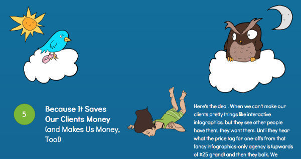
Another great example of parallax design comes from digital marketing agency Portent. It features a woman falling through the content of a blog post, leading the user through an interactive journey of great content.

Down: Its potential to cause conflict between design and SEO
Like Flash and AJAX, parallax design doesn’t exactly present an opportunity for SEO, a point search experts are quick to make. The simplicity of the single page layout won’t do much for ranking around specific keywords. As a result, parallax design relies much more heavily on social sharing than it does on search.
Then again, SEO may be more of a priority for product- and service-focused websites than for content marketing channels. From the design side of the argument, shareable content is the gold standard. After all, visitors only share content that excites them — and exciting content means more leads.
Inviting strong-willed SEO and design experts into the process could result in a battle of sensibilities. Thus, defining strict goals for your project is essential before deciding to equip your presentation with parallax scrolling.
Up: It’s a powerful storytelling technique
We write often about the role that brand storytelling plays in content marketing. You could make the argument that parallax scrolling is one of only a few native techniques for telling your story online.
This New York Times article presents a particularly compelling argument for using parallax design to enhance a content creator’s ability to tell a story. Animations, color, text, and video all interact to give readers a gripping sensation — and help them feel like they are part of that story.
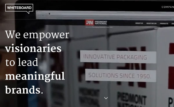
It’s also a compelling tool for brand storytelling, as demonstrated by Creative agency Whiteboard, which used parallax design to create an easy-to-follow company backstory as marketing collateral.

Down: Interaction is difficult to measure
In the age of data, crippled analytics tracking can be a big detractor. Here’s where one of the biggest pitfalls of parallax design comes into play.
Single-page websites may ease the user experience, but they make it tough to collect and analyze different points along the buyer’s journey. That means fewer data points for analyzing how your visitor interacts with longer-form content.
It’s true that parallax design can hamper analytics. Though it doesn’t completely destroy analysis capabilities. For one, it’s still easy to see social sharing metrics. You can also find creative fixes if you look hard enough — continuing a piece of parallax content on a “next” page, for instance.
Still, there’s an organic challenge here that may limit projects of this nature for some content marketers. As the technique matures, expect more permanent fixes.
Up: It’s a major differentiator
Take a look at this interactive guide to Minneapolis and tell me you’ve seen another real estate group take the same approach.

Chances are you haven’t found many examples quite like this, especially not in the housing industry. DRG saw a huge opportunity to create a compelling piece of content that created a different impression than an eBook or brochure.
Some industries are saturated with brand-created content. So, it’s more important than ever to break through the noise with unique approaches to your content marketing. Parallax design is an eye-catching alternative to static pieces of content. It also differentiates from video, as it gives the user control of the page’s movement, based on how she moves her mouse.
Parallax design is still in the early adopter phase, so it currently offers a great opportunity for brands that are willing to take a risk to stand apart from the crowd.
Down: Mobile audiences are left standing
A year ago, I wrote about why content marketers must start divorcing content from form. Mobile trends continue to grow, and if you haven’t yet made the perspective shift, the evidence won’t be easy to ignore for much longer.
Look at each example of parallax scrolling we’ve seen so far and you’ll notice a trend: These websites simply wouldn’t work right on a smartphone. The screen is just too small to include the intended effect in many cases. Site loading can be slow and choppy, and smartphone touch screens just aren’t sophisticated enough to manipulate parallax designs smoothly yet.
The same limitations don’t necessarily hold true for tablet viewing, of course. But missing out on reaching smartphone users is guaranteed to alienate a significant chunk of your intended content audience. Not good.
Unless your content displays easily on any device, it’s married to its form. Pages created with parallax design must revert to a mobile-friendly display or risk missing out on crucial smartphone traffic.
It’s possible to create parallax websites that are also friendly to mobile devices, but marketers should consider the role that mobile plays in their content strategy before jumping into a parallax project.
Weigh in
Is your brand using parallax design for content marketing? Share your examples with us in the comments below.
For more inspiration on creative visual content techniques, read CMI’s Ultimate eBook: 100 Content Marketing Examples.


Comments