The dribbblisation of design
- Fahad H

- Sep 18, 2013
- 7 min read
There are divergent things happening in the product and interaction design community.
On one hand, we have some amazing pieces of writing from the likes of Ryan Singer and Julie Zhuo, moving our craft forward. On the other hand, we have a growing number of people posting and discussing their work on Dribbble, the aggregated results of which are moving our craft backwards. This post is not about Dribbble itself, it’s about what the community on Dribbble value. I’ll use the term ‘product design’ throughout, but I’m including UX and interaction design when I do.
“Looks awesome!” How the Dribbble community rewards superficial work
In the last year I’ve reviewed a lot of product design work from job applicants, at Facebook and now at Intercom, and I’ve noticed a worrying pattern. Too many designers are designing to impress their peers rather than address real business problems. This has long been a problem in creative advertising (where creative work is often more aligned with winning awards than with primary client business objectives) and its becoming more prominent in product and interaction design.
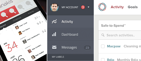
Much of the product design work from job applicants I’ve seen recently has been superficial, created with one eye towards Dribbble. Things that look great but don’t work well. Perfect pixel executions of flat design, but work that doesn’t address real business goals, solve real problems people have every day, or take a full business ecosystem into consideration. Dribbble itself shapes the conversation to some extent, the medium shaping the message, with highlighting of colour palettes and other superficial details prominent in the UI. People look and people emulate. A huge majority of the product design work on Dribbble looks the same. Whether it’s social software, accounting software, a marketing site, a weather app, the same styles are applied. Blur your eyes and try and tell the difference.

The most important product design work is usually the ugliest
In contrast, the best job applicants I’ve seen sent in their thought process. Sketches. Diagrams. Pros and cons. Real problems. Tradeoffs and solutions. Prototypes that illustrate interaction and animation. Things that move, change and animate. Things that use real data.
The worst applicants sent in flat PNGs. PDFs full of wireframes. No articulation of the problem being solved, nor the business and technical constraints. No context. These pixel perfect, retina ready PNGs might look great on Dribbble, but they will have decreasing value as a primary design tool in a real product building environment.
This is why redesigns of other people’s work is pure folly e.g. the new Yahoo logo, iOS7, changes to Facebook, the New New Twitter, the American Airlines rebrand. People have no context for the decision making process involved in these projects, no knowledge of the requirements, constraints, organisational politics.
If product design is about solving problems for people within the constraints of a specific business, then it simply feels that many people calling themselves product/UX designers are actually practicing digital art. They are Artists. They are Stylists. Executing beautiful looking things, certainly an important skill, but not practising product design.
Product Design is about a mission, a vision, and an architecture
From broad ideation to pixel level detail, designers should always be thinking about their company’s mission, vision and product architecture. Everything they do should flow through this funnel.

Design starts at the top of a company with the company mission. Then the company vision. It’s very hard to do great design in an organisation without a clear and actionable mission and vision. Don’t underestimate the importance of this. If your company lacks a clear mission, make it your job to facilitate the creation of one.
After the mission and vision is the product architecture. Not the technical architecture, rather the components of your product and how they relate to one another. The system. On the first morning of the first day of work at Facebook, Chris Cox (VP of Product) gives an incredible introductory talk (you can get a small flavour of it here). With an audience of people from any job function at the company, whilst he could talk about anything, he focuses on explaining the product architecture, and how it relates to the company mission.
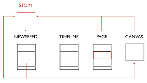
For Facebook, that architecture is a directory of people, their friends, and their interests; a directory of businesses, from global brands all the way to small local corner shops. And on top of that directory is a map, showing the relationships between all those things. It’s a crystal clear articulation of the product, directly relatable to the mission. In my experience it’s very hard to do great design in an organisation without a clear, well defined product architecture. And in many cases, just like the mission, it’s the designer’s job to help figure out and evolve this architecture. When describing Facebook to external partners, I often drew diagrams like this one on the whiteboard:

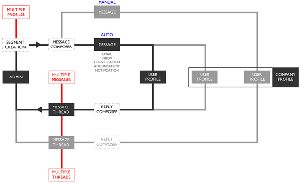
A product architecture is not an information architecture. It is not a set of pages that link to one another, or something that shows modals and describes what buttons do. A prototype will always serve this purpose better. It is a level deeper than that. It is the structure. The building blocks. It shows the objects in the system, and the relationships between them. At Intercom we also think about design in the context of our product architecture:

I can’t ever remember seeing a product architecture described on Dribbble. It’s still too rare to witness a designer talk about how their work maps to a mission, drives a vision forward, or how it is placed within product architecture, with the weight that these things deserve. This should be the norm, not the exception.
Once you have a clear mission, vision and product architecture, you can start to think about the other details. The goals people have, what makes them happy, fulfilled, successful. The jobs your product does for them, where it works well, where it doesn’t.
The rough ugly sketches and scribbles that describe these things are far more important than the png that ends up on Dribbble. In the process from inception to shipped functioning product, photoshop files and PNGs are the least interesting and important aspect to me. Much more important is the discussions where trade offs were made. Where pros and cons were discussed. Where people mapped ideas to the company vision, or evolved things based on the product architecture. All the whiteboard sketches, hand drawings, and back of the napkin problem solving is what designers should be posting on Dribbble. Show me those things. Even a written description of what is being built is more important than the PNG or PDF.
Think about four layers of Design
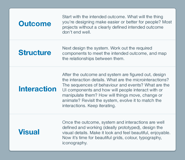
Design is a multi layered process. In my experience, there is an optimal order to how you move through the layers. The simplest version of this is to think about four layers:

I see designer after designer focus on the fourth layer without really considering the others. Working from the bottom up rather than the top down. The grid, font, colour, and aesthetic style are irrelevant if the other three layers haven’t been resolved first. Many designers say they do this, but don’t walk the walk, because sometimes it’s just more fun to draw nice pictures and bury oneself in pixels than deal with complicated business decisions and people with different opinions. That’s fine, stay in the fourth layer, but that’s art not design. You’re a digital artist, not a designer.
Designing systems will matter more and more as the web permeates everything
The invention of the web will lead to the biggest changes to society since the Industrial Revolution. The web is permeating everything. It’s in our homes, in our workplaces, by our bed when we’re asleep, and in our pockets everywhere we go. The web is with us all the time. It’s already moving into our cars, into our clothes, into the things we own, into monitoring our health. By 2020, if not before, all businesses will be web businesses. As Charles Eames once said, “Eventually everything connects“.
Designing static, linked web pages is a dying profession. The incredible rise of mobile technologies, APIs, SDKs, and open partnerships between platforms and products paints a crystal clear picture of a future where we will all design systems. PDFs full of wireframes are a dying deliverable, Photoshop is a dying product design tool. Designers moving our craft forward are moving between sketches, whiteboards and prototyping tools (Quartz Composer, After Effects, Keynote, CSS/HTML).
This is one reason people say designers should code. Whether you agree with that or not, designers certainly need to define the problem and solution not in pixels, but in terms of describing what happens between components in a system. Then build prototypes, start coding, and fine tune the details as real data inevitably shows things that were overlooked and couldn’t have been predicted. Working interactions with real data give you a better sense of how something feels.
We’re designing around Jobs
At Intercom, we’re working with Clay Christensen’s Jobs framework for product design. We frame every design problem in a Job, focusing on the triggering event or situation, the motivation and goal, and the intended outcome:
When _____ , I want to _____ , so I can _____ .
For example: When an important new customer signs up, I want to be notified, so I can start a conversation with them.
This gives us clarity. We can map this Job to the mission and prioritise it appropriately. It ensures that we are constantly thinking about all four layers of design. We can see what components in our system are part of this Job and the necessary relationships and interactions required to facilitate it. We can design from the top down, moving through outcome, system, interactions, before getting to visual design.
As well as using Jobs, we’re building a pattern library to reflect the system oriented nature of our design work. We’ll design more and more by using the library code rather than Photoshop. It’s not a perfect process. We iterate it constantly.
I’d love to hear how all this resonates with how you work. Please comment below!
Update
In response to many comments here, on Twitter etc. I wrote a follow up post How to hire designers. Check it out!
Some people on Twitter and HN have suggested that I’m conflating visual design with UX design. I disagree. In my opinion you cannot consider visual design of an interactive product without considering the interaction and system design. This is not graphic design. We’re not designing posters, or even road signs.
Notes
You can thank Des for the wonderful title of this post.
Like what you read here? Why not come and work with us? We’re hiring for roles in Dublin and San Francisco.
The four layers above are an adaptation of a six layer model we used at UX Consultancy Flow 7 or 8 years ago, which itself was an adaptation of Jesse James Garrett’s seminal diagram.
Dribbble is a pretty good product, this is not about them per se. They could probably do a lot more to focus the community they are building away from superficial aesthetic work to more substantial problem solving work (unless they want Dribbble to be a place for digital art which might be the case).
Dribbble designs in the header from bwaddington kolage claudioguglieri alden BillSKenney dash Or get the umbrella app 🙂


Comments