Creating Preview Videos: Your BFF for Getting App Downloads
- Fahad H

- Jan 22, 2016
- 5 min read

With more than 60% of downloads coming from users searching inside the app stores, a great preview video is necessary to tell a compelling story to convert shoppers from “just browsing” to “engaged users.”
An app preview video requires more work than simply recording the app in action. It is the first creative asset that users see. Everything from the call to action down to the colors and features highlighted in the first few seconds can be the difference between hundreds and thousands of conversions.
At least a quarter of all organizations surveyed in 2016 Content Marketing Institute research use mobile apps – 26% of North America’s nonprofits to 43% of North America’s B2C companies. And, given that each of the leading stores (Google Play and Apple’s App Store) sells more than 1.5 million apps, content marketers can get off to a better start when their app preview content stands out and engages potential customers.

Here are some things to consider when developing a great app preview video.
Start with the store’s preferences
One fact that will never change: If Apple or Google Play doesn’t bless the app, it doesn’t exist.
Before an app can begin its long life in the store, a member of the app store’s internal team will review your build, including the preview video, to determine if it meets technical requirements and creative standards.
On its site, Apple warns developers against publishing previews irrelevant to the app’s content and functionality, and encourages them to create previews that use video-screen captures, voice-overs, and textual and design overlays.
When working with apps, unspoken rules and regulations ultimately make the greatest difference. These Apple guidelines can help you lessen the risk of rejection for your preview video and make your app the bell of the in-store ball:
Use QuickTime Player to capture the native resolution of the user interface.
Use straightforward transitions like dissolves and fades so the preview doesn’t imply functionality the app doesn’t have.
Show a higher ratio of video from the app to cut scenes (also known as event scenes) as cut scenes give a false impression of the actual user experience.
Stay within the app; don’t show animated hands, fingers, or over-the-shoulder views.
Videos that misrepresent the user experience – intentionally or unintentionally – are not viewed as optimal by Apple and may be subject to build rejection. Apple wants preview videos to show a true representation of the gameplay itself rather than a promotional commercial.
Google Play makes it a little easier for developers. Google Play’s preview video guidelines don’t outline much, only stating that videos should be kept between 30 seconds and 2 minutes, giving developers the opportunity to be more creative with what they have.
For example, Peggle Blast’s App Store Preview Video only shows in-game use cases of the app as well as music from the app itself. Peggle Blast’s Google Play app preview takes a more creative spin on showing how the game works:
It’s important to keep in mind that Google Play’s preview video is in the form of a YouTube video, so no matter the orientation it will be constrained in the landscape format.
Pick the right orientation
Whatever users see displayed in the immediate app-store search results sets their expectations for the app. Choosing the right video orientation could make all of the difference to your visual allure.
Portrait mode
A portrait-oriented app with a preview video in portrait mode has its poster frame and first screenshot consuming roughly 38% of a device’s screen space.

Click to enlarge
Having two separate images, each of which does not span half of the screen’s width, means text callouts need to be shorter, art needs to be smaller, and some minor details may get lost.
For example, Candy Crush Saga’s two portrait-oriented screenshots are minimized in the search results, making the finer details harder to discern and the text smaller and more difficult to read.

Click to enlarge
Apps with portrait-style gameplay typically keep the preview video orientation in portrait mode. The use of the same display format is in line with Apple’s guidelines to show a true representation of the app’s features and gameplay in the video and without too many cut scenes.
Landscape mode
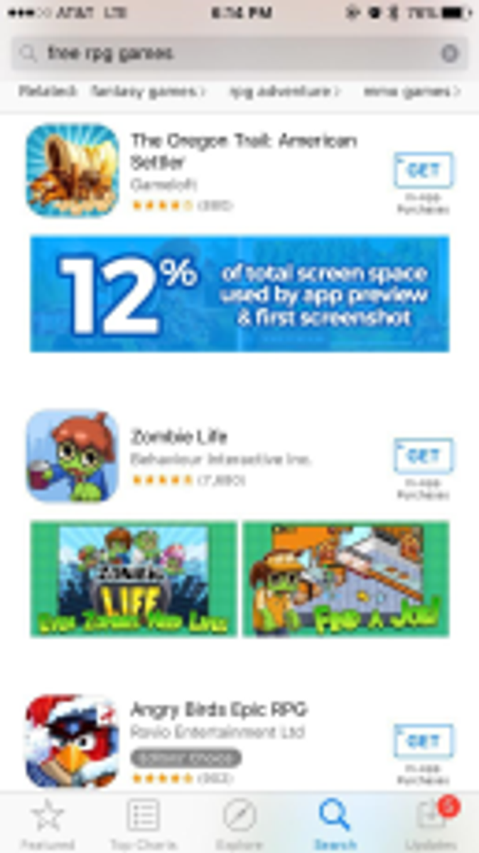
Landscape mode poses a different hurdle for developers. Apple now allows for two landscape-oriented visuals to appear in a search result.

Click to enlarge
If both the preview video and first screenshot are in landscape mode, any graphics and text are difficult to read.
However, landscape-app previews lend themselves to giving developers more room to show off other features of the app, such as tools, or to use the empty space around the portrait frame for special designs, marketing text, or callouts.
For example, the Cake Story app is native in portrait mode, but its preview video is in landscape mode, allowing the developer to prominently feature characters from the game and gameplay.

Click to enlarge
Create engaging poster frame
The poster frame of an app preview video is its “paused” state – the first thing a user sees in search. It should be treated like a screenshot in and of itself.

Click to enlarge
Perhaps you worry that the poster frame of your app preview video lacks definition or clarity and that it isn’t compelling to end-users. In this case, the frame can be changed by selecting another poster frame image in iTunes Connect.
To keep your poster frame engaging and informative, consider selecting a frame of your video that most accurately portrays the app.
Bejeweled’s poster frame prominently features its matching game, as well as a caption letting readers know that it is a “match 3 puzzle game.” Keep in mind that users may be briefly glancing through search results – if they are looking for a match 3 game, including it in the poster frame allows them to see that they should try your app.
Use data to sell your app
App-preview videos are the gatekeepers of an app’s conversion funnel. After a searcher discovers an app, several factors come into play to make them a user of your app. Here are some tips:
Every preview video should undergo serious testing to ensure that it is optimized for your target audience. With surveys, focus groups, and multi-variant testing platforms, marketers can collect quantitative and qualitative data on what makes users want to click “GET” in an app store.
Make sure to carry through keywords from your application and highlight them in your screenshots and video for best conversion.
A great example is the Bejeweled app preview’s first text callout — “a sparkling match 3 puzzle game” – as it includes search terms, such as “match 3” and “puzzle game,” used by thousands to find games similar to the one being marketed by PopCap Games.
Click to enlarge
RECOMMENDED FOR YOU: Data: The Missing Piece in Your Content Marketing Strategy
Final musings and takeaways
App previews play a huge role in engaging a user from the start to the moment of purchase. With a strong app preview that follows the stores’ guidelines and flaunts the app in a way that does it justice, a developer can create a visual app representation that will make waves in conversion rates.
Want to get expert insight, tips, and takeaways to better your content marketing? Sign up to receive CMI’s daily or weekly email.
Cover image by Viktor Hanacek via picjumbo.com
Please note: All tools included in our blog posts are suggested by authors, not the CMI editorial team. No one post can provide all relevant tools in the space. Feel free to include additional tools in the comments (from your company or ones that you have used).


Comments